
CHERRY PICKED GAMES
Only the Sweetest Games — As a brand continues to grow, it’s important that the design continues to serve the brand to its fullest potential. Every so often, we should evaluate the visual “voice” of the brand. Does it clearly communicate our message?
We did a deep-dive on Cherry Picked Games, starting with identifying the brand’s goals, beliefs, and voice. Having a strong visual identity is pivotal to growing a brand and increasing perceived value.
ROLE
SCOPE
Brand Development
Logo Design
Graphic Design
Website Design
Art Director
Graphic Design
Logo REFRESH
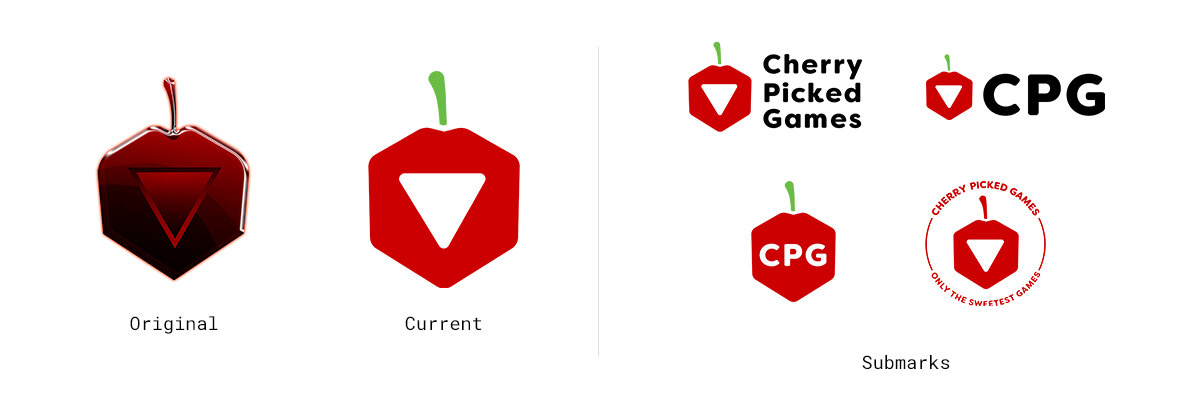
One of the most important changes was to update the logo to something more usable. This involved simplifying the logo to a flat vector without abandoning the essence of the original. I then created a suite of versatile submarks that could work across multiple mediums and applications.
TYPOGRAPHY
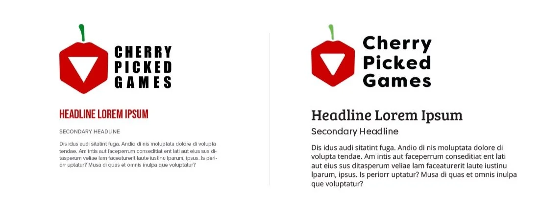
The previous typography was bold but a little too harsh. As an independent game developer, we want to present a more friendly, somewhat quirky personality which is more true to the company itself.
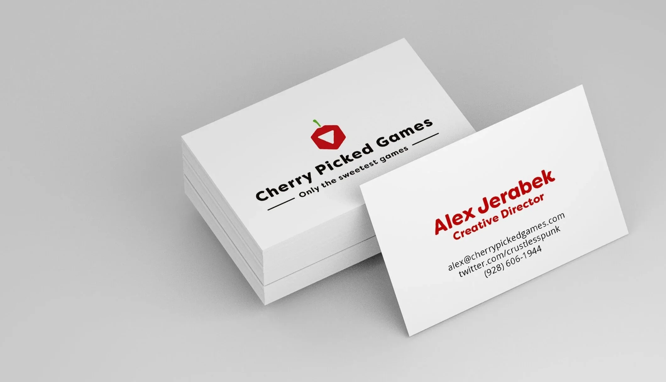
STATIONARY
As a smaller operation, making connections is a huge part of our success. Business cards are often the first impression you get when networking and it’s important to make an impact.
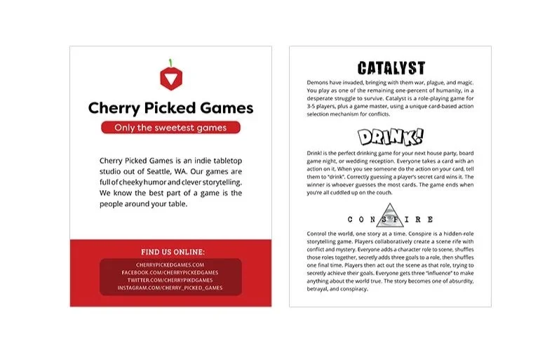
FLYER TEMPLATE
By creating a standard flyer template, Alex was able to separate his personal information from the company. It made it much easier for him to network with professionals and distribute more information about his games.
Please visit the Cherry Picked Games website here.
Additional Collateral
Cherry Picked Games’ branding is more consistent and flexible across all mediums increasing brand recognition and professionalism.
RESULTS
Credits/
Collaborations:
©Cherry Picked Games